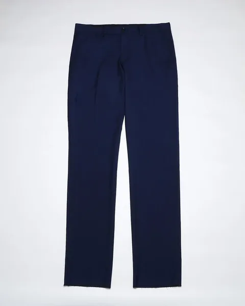
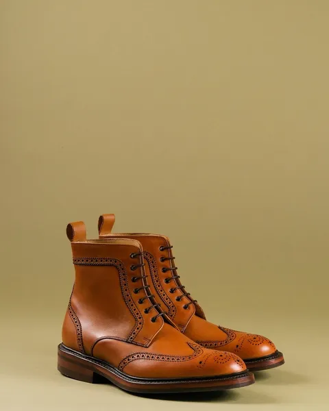
The formula · Outfit Formulas
Monochrome Outfits Live or Die on Seam Placement
In a one-color outfit the eye reads seams instead of contrast. How shoulder, waistband and hem placement decide whether monochrome looks resolved.
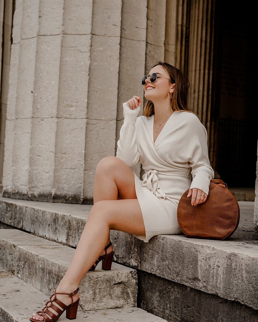
Strip color from an outfit and the eye keeps working. It moves to the next available signal: the shadow under a shoulder seam, the line where a waistband crosses a shirt, the shift in reflectance where a matte trouser meets a satin jacket. In one color those edges are the composition. A monochrome outfit can fit well at every point and still read unresolved because its seams and its surfaces are saying different things.
When color stops separating the pieces
Two garments in the same color separate only at their boundaries, which makes every boundary load-bearing. A seam sitting half an inch off its intended line disappears in a navy-and-cream outfit and becomes obvious in an all-navy one, because nothing else is competing for attention. The same applies to a hem that lands an inch low or a sleeve that stops short of the wrist bone.
The practical consequence is that monochrome is chosen the way tailoring is chosen: placement first, shade second. Most people reverse the order, matching the dye and hoping the fit follows, then wondering why a technically correct outfit looks flat.
The shoulder seam is a drawn line
On a set-in sleeve the shoulder seam should land within 0.5 inch of the shoulder point, the bony edge where the arm meets the torso. Further out and the sleeve head collapses into a fold; further in and the seam pulls across the top of the arm. In one color the seam casts a shadow and reads as a line drawn from the neck to the arm, so the error is legible from across a room.
A drop shoulder is drafted to sit 1.5 to 2 inches beyond the point, with the seam deliberately low. What fails is the compromise: three-quarters of an inch out on a jacket drafted as set-in. The garment cannot decide what it is, and in monochrome that uncertainty becomes the only visible feature. The construction detail is covered in shoulder seam placement.
The horizontal seams carry the waist
At the waist, three seams stack: the shirt hem, the trouser waistband and, if worn, the belt. In a contrasting outfit they read as separate pieces. In one color they read as a single band, and its width decides how the body divides. A 1.5-inch waistband reads as a belt even without one; a 1.25-inch band reads as a finish. Neither is wrong, but the choice should be deliberate, and it should not be made twice in the same outfit.
Rise sets where that band lands. A 10- to 11-inch front rise puts it at or above the navel and lengthens the leg line; a 9-inch rise sits an inch lower and divides the body closer to its middle. In a single color the difference between the two is more visible than it would be with a contrasting belt, because the eye has no other horizontal to use as a reference. The range is set out in rise explained.
Sheen is the second structure
Color is not the only property that separates two surfaces. A worsted wool trouser and a viscose satin jacket can carry the same black and read as different colors under a downlight, because one reflects light in a broad matte scatter and the other in a narrow highlight. The dye matches; the specular reflection does not. In flat daylight the difference compresses. Under evening light it opens, which is why an outfit that looked correct at noon can look two-tone at dinner.
The working rule is to match sheen as closely as value. Two matte pieces are the safest combination. One lustrous piece against matte is a controlled contrast and gives the eye an edge without a color break. Two high-sheen pieces, a satin shirt under a satin jacket, remove the edge entirely and read as a single reflective surface. Wear changes sheen as well: pressing leaves iron shine on wool, and elbows and knees polish before the rest of the garment does, so an older piece in a monochrome outfit sits slightly brighter than a new one in the same dye.
How close in value is close enough
Keeping the pieces within about 10 percent of each other in lightness holds the one-color effect. Beyond that the outfit becomes two-tone with a shared hue, which is a different look and needs to be chosen rather than stumbled into. The check is simple: put both pieces on a neutral surface in daylight, photograph them together, and convert the photograph to grayscale. If the boundary between them is still visible in gray, the value gap will be visible in color.
Cream, ivory and white sit close enough to pass at a glance and far enough apart to fail under a camera flash. Stone and oatmeal behave the same way. When two pieces cannot be brought together, a third piece in a value between them bridges the gap and turns the mismatch into a deliberate progression.
Hems, sleeve ends and the vertical
A jacket hem should land at the hip bone, roughly 7 to 8 inches below the natural waist, so it clears the seat without cutting the leg. Two inches lower covers the widest part of the hip and, in one color, merges with the trouser into a block with no waist.
Trouser hems follow the same logic. A full break of 0.5 inch stacks fabric on the shoe and shortens the leg; a slight break of 0.25 inch or none keeps the line unbroken. Sleeves should finish 0.25 to 0.5 inch above the wrist bone so a sliver of hand shows. That sliver is one of the few interruptions a monochrome outfit has, which is also why wide-leg proportions depend on preserving the vertical rather than adding detail to it.
Why pale and black fail differently
Pale monochrome exposes structure. Cream and ivory show the shadow of a pocket bag through the trouser, the edge of an underlayer at the neckline, and every crease across the lap. A pale outfit therefore depends on clean internal construction more than a dark one: lined trousers, a camisole that matches the shirt, seams pressed open.
Black does the opposite. It absorbs light, so seams soften and the outfit falls back on silhouette and sheen. Lint, pilling and dust show at once, and a black garment that has faded at the collar reads as a different black from the trouser. Mid-gray sits between the two and forgives more than either, which is why it is the easiest monochrome to build and the least striking.
What to alter first
Alterations should follow the order of visibility. Hem length is the cheapest and most visible, at roughly USD 15 to 30 for a trouser and USD 20 to 35 for a jacket. Sleeve length follows. Waist suppression is the third, at USD 25 to 40, and it changes the line more than the width suggests.
Shoulder width and armhole depth are not on the list. Reworking either costs more than the garment is worth in most cases, and the result rarely sits correctly because the sleeve head has to be recut. A monochrome outfit makes those faults more visible rather than less, so a jacket that needs shoulder work is a return, not an alteration.
Frequently asked
- Why does a monochrome outfit look wrong even when each piece fits?
- Because color no longer separates the pieces, so the eye uses seams and edges instead. If the shoulder seam sits an inch off the shoulder point or the jacket hem lands mid-hip, there is no contrast to distract from it.
- Should a monochrome outfit use the exact same shade?
- Not necessarily, but keep the difference under about 10 percent in value. A cream trouser against an ivory jacket reads as a deliberate pair; a white trouser against a stone jacket reads as a mismatch under daylight.
- Does texture replace contrast in a one-color outfit?
- It can, at the same value. A matte wool trouser against a satin-backed jacket gives the eye an edge without a color break, provided the two fabrics share a similar lightness under the same light.